Trusto
Objective
Our goal is to create a visual identity system that can convey a brand’s vision to make groceries convenient –
- Vision – Our vision is to be the most convenient solution for grocery shopping.
- Mission –By connecting local vendors and consumers, we aim to create easy and convenient shopping a reality.
Scope of the project
Strategy
Identity design
Naming
Branding
Brand attributes
The brand is associated with convenience, trust, homemade food –
Motherly
Nurtured
Empowered business

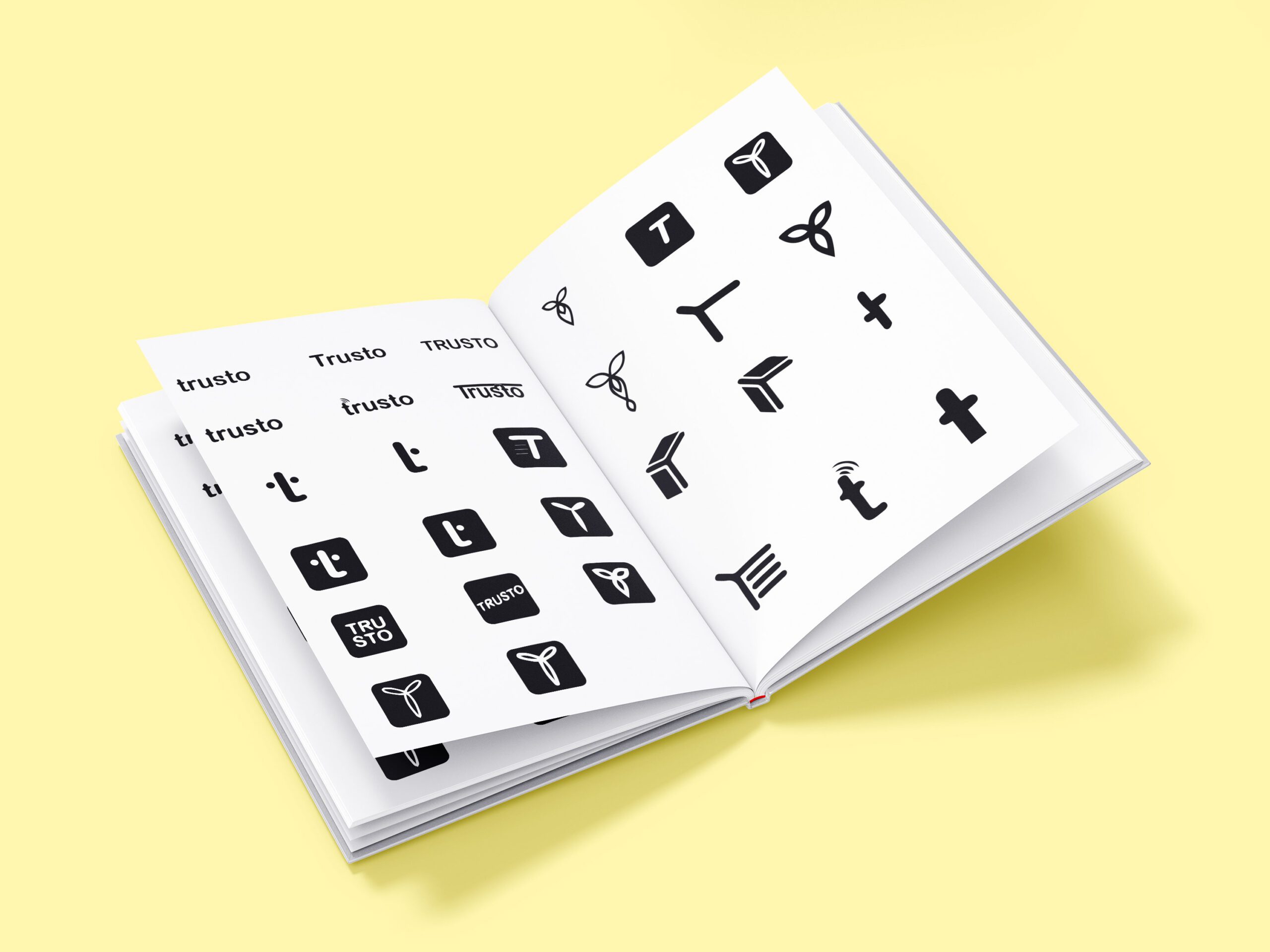
Logo Development
When designing the logo, we wanted to give it a humane look and feel.
The Logo
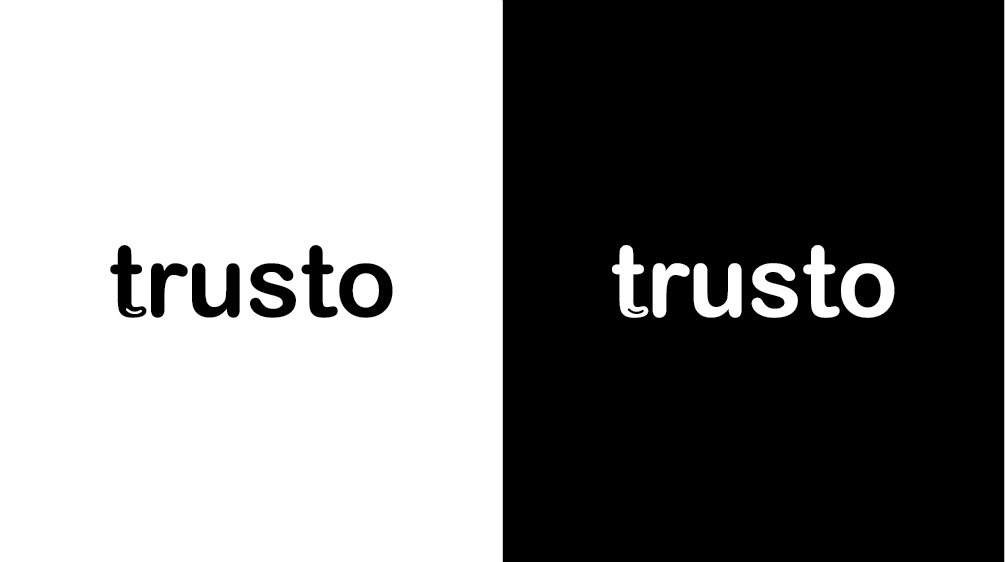
This final logo is a humane typographical treatment of the brand name, which becomes the instant identification of the brand when it is seen.
Finding the Type
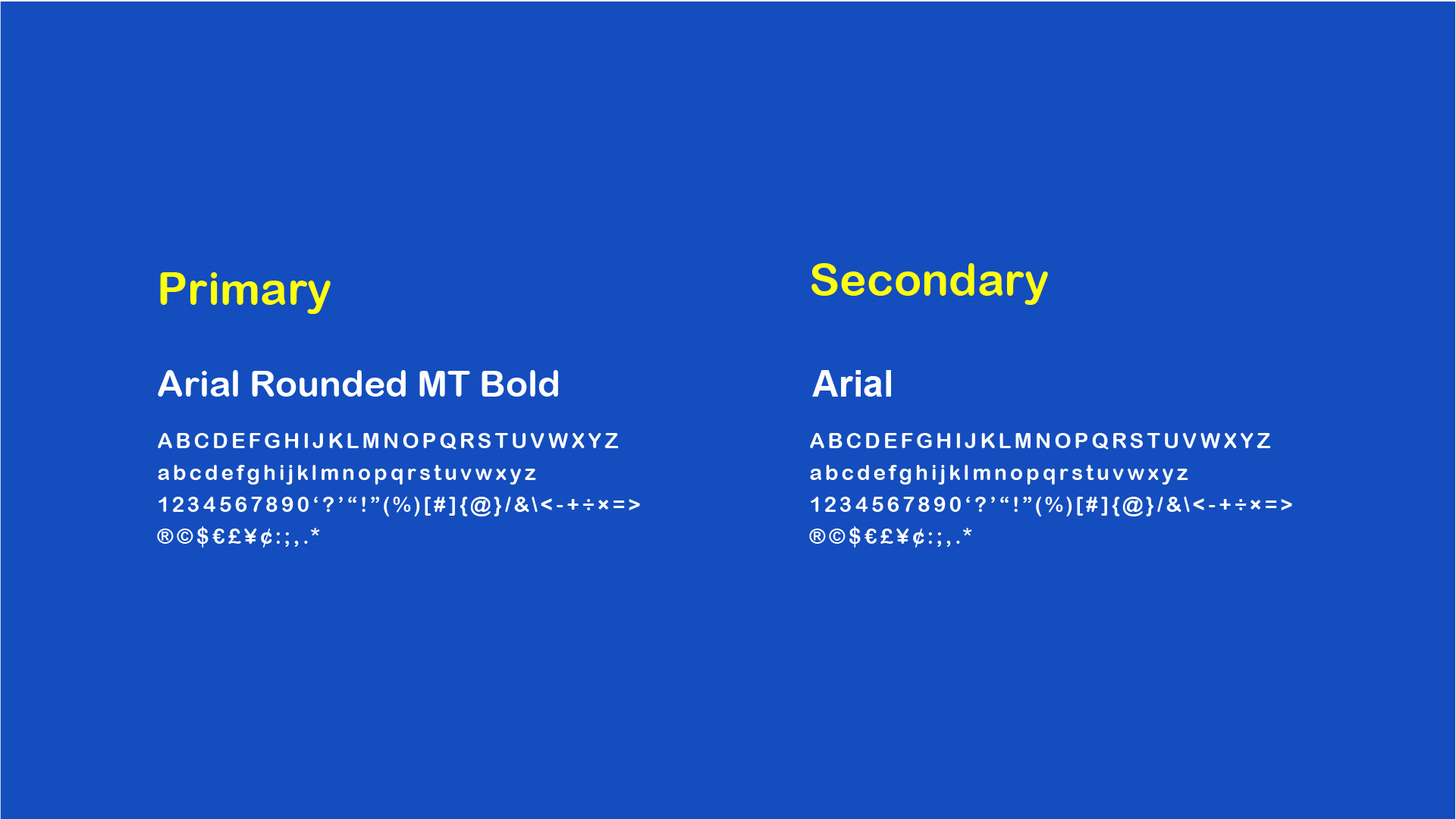
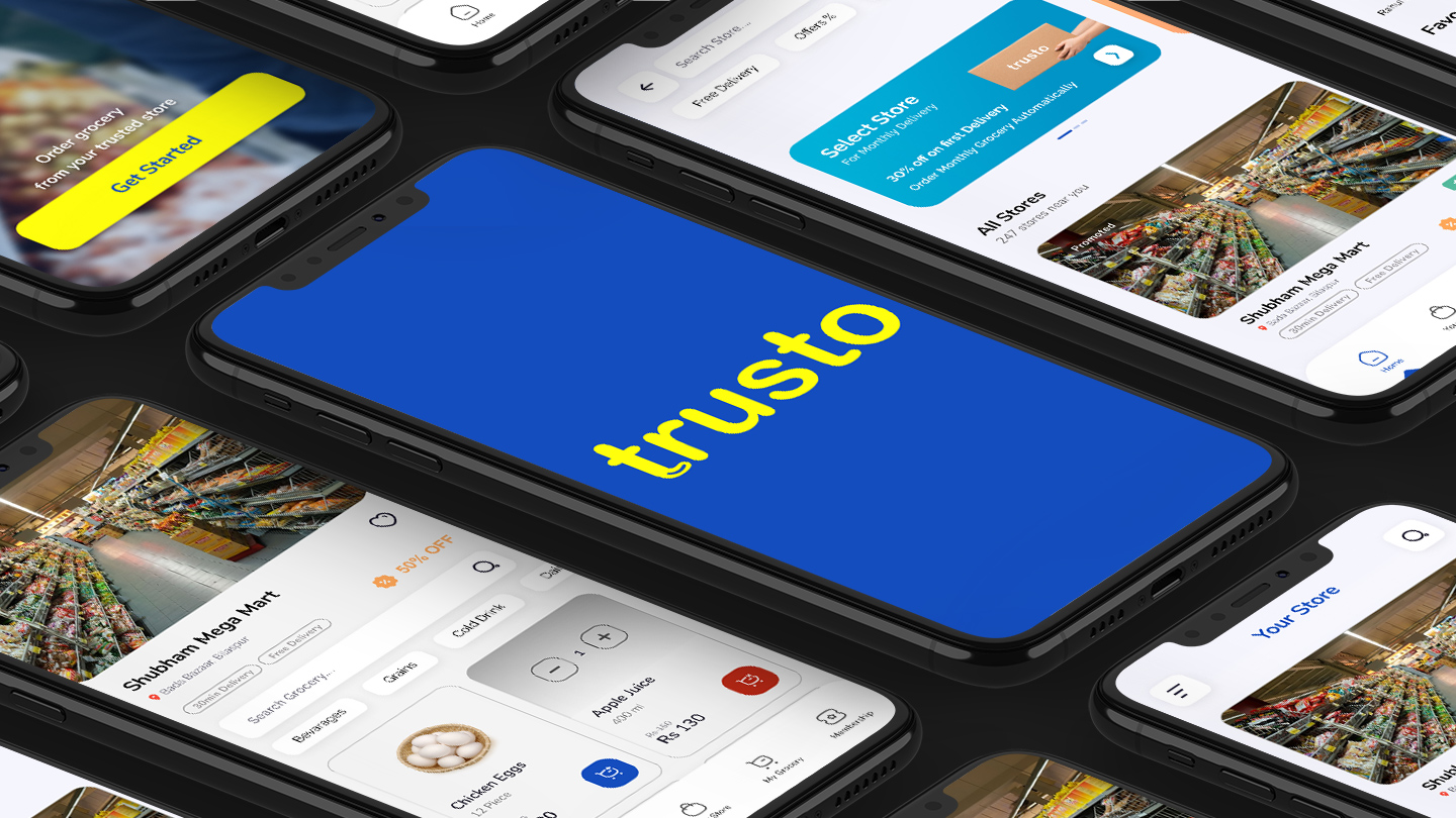
Using Arial Round MT Bold font for headings and logotype gives a humane feel, and we chose Arial as a secondary typeface to complement the primary typeface and also has good visibility for the trusto app.
Identity System
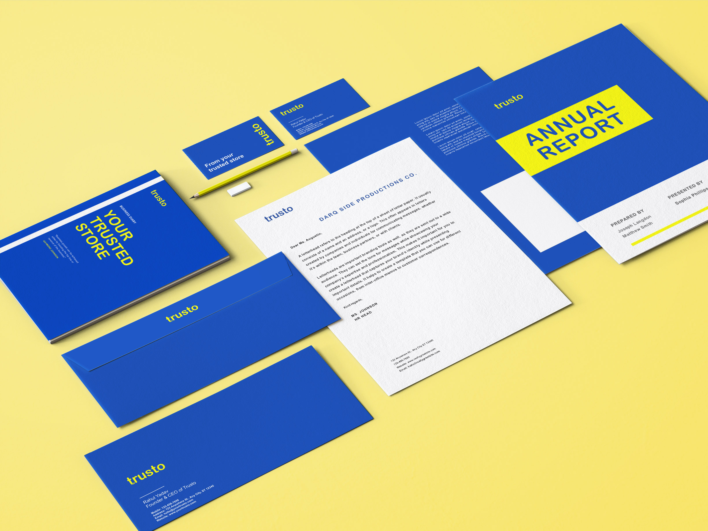
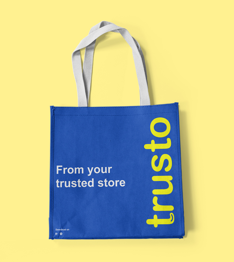
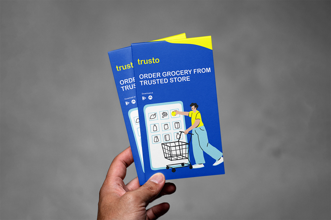
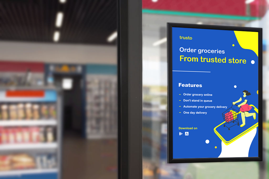
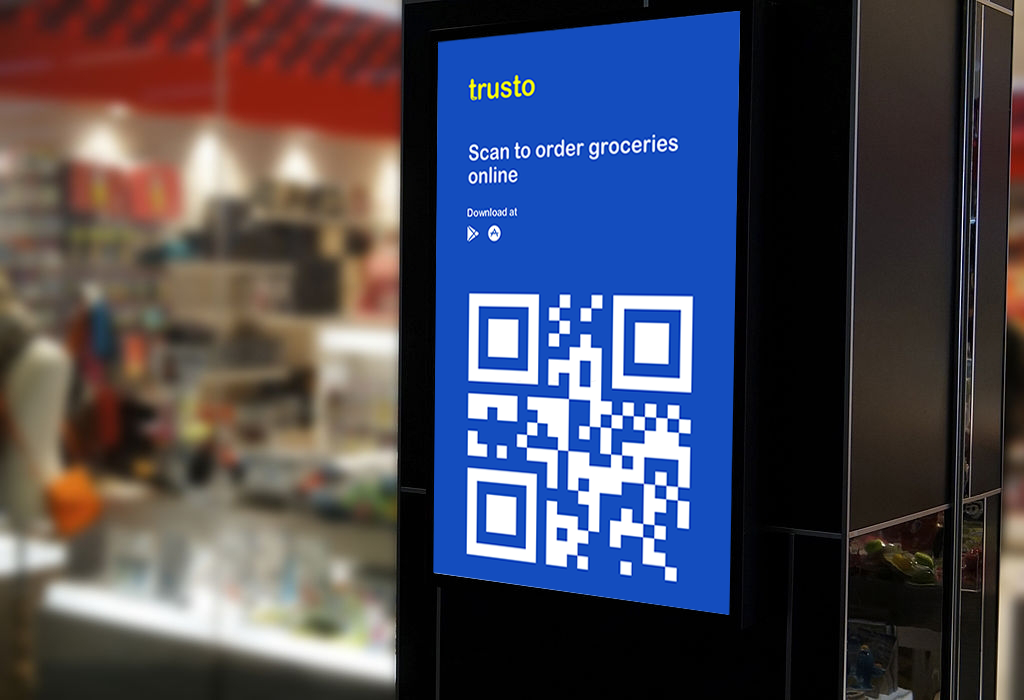
The identity system was designed to assist in marketing recognition and to help brands receive a favourable first impression.

Positioning
The brand is positioned for people who have little or no time to themselves and would rather spend their time with family or other important tasks.

Social Media
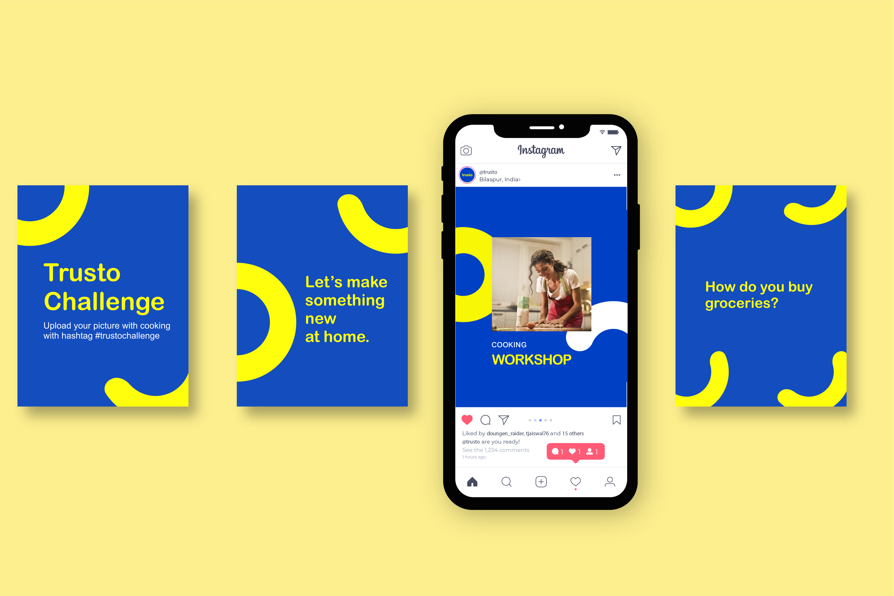
To build brand awareness and engage with the customer, we made strategies around daily life food, cooking, health challenges
